
 |
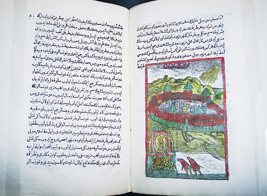
| FROM A. X. RAFIKOV, OCHERKI ISTORII KNIGOPECHATANIYA V TURTSII, SCIENCE PUBLISHERS, LENINGRAD, 1973 |
Written by Eildert Mulder
In a recent exhibition on Ottoman culture held in Amsterdam’s Nieuwe Kerk was an unimpressive-looking little 18th-century book, a printed version of a manuscript produced 150 years earlier. Usually a manuscript is more rare than a printed work, but in this case the cultural and historical importance of the printed book surpassed that of the manuscript from which it derived: This was one of the first books printed in the Middle East in an Arabic typeface. The language was Ottoman Turkish.
The book, titled The History of the West Indies, dates from 1730, comprises 91 pages and four maps and includes illustrations of plants and people. Its author is uncertain, but the name of the printer who produced it is known: He was the Hungarian Ibrahim Müteferrika, the man who started an information revolution in the Muslim world.
 ohannes Gutenberg introduced printing with moveable type in Europe in about 1450. By 1500, Gutenberg’s innovation had completely transformed the intellectual and economic landscape of Europe—but it had not been adopted in any Middle Eastern country. Why not?
Moveable type had been tried and rejected before, in China in the 11th century and in Korea in the 13th. In both places, the enormous size of the Chinese character set used by both languages meant that it was faster to cut whole-page woodblocks than to cast as many as 40,000 different characters and set them one by one. A similar problem, part technical and part esthetic, blocked the use of moveable type in the Arabic-speaking world—and in the Ottoman Empire, whose language was written in Arabic script.
The technical problem is this: Arabic letters are generally not written separately but joined to each other in groups or entire words, like a script typeface in English. And though the Arabic alphabet has only 28 letters, most letters have four forms, depending on whether they occur at the beginning of the word, in the middle of the word, at the end of the word, or stand alone. Furthermore, each combination of letters is unique, creating a typographic challenge greater than Chinese. Because all letters connect dynamically with the preceding one, and most also with the following one, the number of unique combinations is almost astronomical.
The esthetic problem comes from the dizzying mutability of written Arabic. For example, there are actually three ways the letter ha can be written in the middle of a word, and the calligrapher’s choice is influenced not only by the letter immediately preceding the ha, but also by the letters earlier in the word, and even by letters that follow it—yet, in whatever form, it is still in essence the ha in the beginner’s textbook. A sequence of letters can run along a baseline the way Roman letters do—though Arabic runs from right to left, of course—or they may start above the baseline and descend in a diagonal if the connections from one letter to the next make that an esthetically pleasing choice.
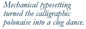
The result is that the individual letters in a well-written piece of text are in constant motion, like dancers in a polonaise: In the course of the dance, they bow to each other, embrace each other, push each other away, hug each other’s necks and fall at each other’s feet—and there are some real acrobats among them. Thus, well-written Arabic texts feel alive to their readers, whereas mechanically typeset ones feel like graveyards: At their best they are only still photographs of the calligrapher’s living, moving polonaise.
European type founders of the 16th century, including some famous names, attempted to produce Arabic fonts, but the results were terrible. The designers forced Arabic script to conform to the technical requirements of typesetting, for they had neither properly analyzed the script nor absorbed the Arabic textual tradition. Calligraphers, in contrast, absorbed that tradition and learned to make esthetic decisions as they learned their craft, by endless practice that eventually “made perfect.”
The rejection of book printing between 1450 and 1729, when Müteferrika produced his first book, was thus not the result of conservative unwillingness or cultural inflexibility. It was the rejection of an unsuitable technology. As Thomas Milo, an Amsterdam Arabist and type designer, put it, “It was as if you had urged someone who was riding in a magnificent horse-drawn carriage to get out and ride in a Volkswagen with square wheels.”
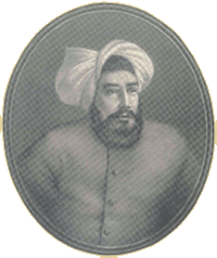
 brahim Müteferrika was a refugee, a Protestant Hungarian who lived in Transylvania, then part of the Austro– Hungarian Empire. Protestants had a hard life there, and Müteferrika fled to the Ottoman lands and converted to Islam. Perhaps because he was an immigrant, he noticed both the lack of a book-printing industry in his new homeland and the fact that public exchange and discussion of ideas—as well as technical and scientific progress—was less vigorous and widespread than in Europe. Müteferrika believed that the Ottoman Empire needed a book-printing industry in order to develop, but he also understood that no Ottoman printing industry would be possible without a typeface that deserved the name of Arabic.
 |
| THOMAS MILO |
| The History of the West Indies was the third book printed in the Middle East using moveable type, and the first with illustrations. In Europe, movable type was developed just after the fall of Constantinople sent Byzantine scholars—with their collections of Greek manuscripts—streaming into Italy, where the printing press facilitated the circulation of Greek learning throughout Europe. Printing from moveable type, coming as it did at the peak of the Renaissance, was also a key factor in the swift dissemination of advances in scientific, technological and industrial knowledge. Conversely, the absence of printing was an important element in the decline of the Ottoman Empire. Ibrahim Müteferrika persuaded the Ottoman sultan that only wide dissemination of Europe’s knowledge could enable the empire to arrest the decline, and he received permission to establish a printing press for that purpose. |
To produce such a typeface, Müteferrika knew he had to analyze Arabic script. Calligraphers might learn to make the correctly shaped letter combinations by practice, without conscious application of tens of thousands of rules, but for machine reproduction of the script, deciphering those rules was exactly what was essential.
Using the limited technical resources of his time, Müteferrika succeeded in producing an Arabic typeface that gave primary importance to the nature of the Arabic script. Indeed, that had been part of his instructions from the Ottoman religious authorities, whose permission was essential for his project: He might mechanize existing calligraphic styles, he was told, but he was not to produce a bastardized, derivative form, and he was not to devise any new font designs. His font was the best produced to that time, says Milo.
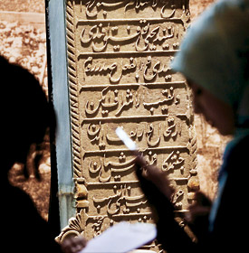 |
| PATRICK POST / HOLLANDSE HOOGTE |
| Exhibition visitors view the calligraphy on an Ottoman tombstone. |
 ilo knows, because he has made the same kind of study of Arabic script that Müteferrika did. Together with Mirjam Somers, a graphic designer, and his brother-in-law Peter Somers, an aeronautical engineer, he created the conditions for the “essential” Arabic script.
That reconstruction is at the heart of the new Tasmeem computer typesetting system, which makes it possible for the first time to set Arabic text in its full calligraphic glory. (Tasmeem means “design” in Arabic.) An example was in the Nieuwe Kerk exhibition, where a mock-up of a mosque interior is decorated with verses from the Qur’an in Milo and Somers’s Tasmeem, a perfect reproduction of the most beautiful Arabic calligraphy, coming not from the pen of a great Ottoman calligrapher but from a computer.
Immersing himself in his study of the Muslim world, Milo delved into a variety of disciplines, sometimes spotting cross-connections that might have eluded others. He studied Russian, Turkish and Arabic, and traveled throughout the Middle East. He found that the writings of Russian Arabists sometimes illuminated topics—including Arabic script—from angles not found in western sources. And Turkey, in particular—the country that switched from Arabic script to Latin letters almost from one day to the next in 1928—turned out to be a treasure house of the most beautiful examples of Arabic calligraphy and typography for Milo and Somers to work with, for Ottoman Turkey, the artistic and political center of the Middle East for more than four centuries, was where great masters—perhaps the greatest masters—of the art had worked.
 n essential further step in Middle Eastern typographic design came, a little more than 100 years after Müteferrika, from the hands of an Armenian typographer named Ohannes Mühendisyan. His fonts—perhaps thanks to his early training as a jeweler—were far more graceful than Müteferrika’s, and based, he wrote, on the “tauter” Ottoman calligraphy of the great Mustafa Izzet Effendi.
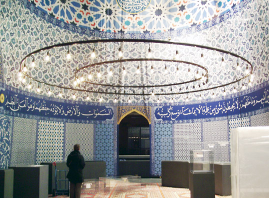 |
| THOMAS MiLO |
| Tasmeem’s computer calligraphy of the Throne Verse of the Qur’an embellished part of an Ottoman culture exhibition in Amsterdam. |
As the Tasmeem team examined Mühendisyan’s work, they found an identifying characteristic: a small aberration that would also appear in the many later fonts produced by Mühendisyan’s successors. He had done his analysis of the hundreds of possible letter combinations very well, but in one particular letter sequence, lam–meem, he drew the ligature between the letters in an unusual way. (Lam and meem are the equivalent of l and m, respectively.) In this situation, meem should start with a right-to-left curving horizontal stroke that flows into a vertical “tail,” and the vertical stroke of the lam preceding the meem should end with a slight rightward movement that puts the pen in the correct position to begin the meem. This is not what one would expect, because lam, in its stand-alone form, ends the vertical stroke with a prominent leftward horizontal line. Mühendisyan’s idiosyncracy was to curve the bottom of the lam’s vertical slightly to the left, then add an extra rightward stroke to put the pen in the correct position for the meem.
 espite such errors, Mühendisyan’s typefaces honored the spirit of Arabic script and were the first to mobilize its full power and richness. Yet in subsequent centuries the central question would have to be answered again and again: Could Arabic script retain its own character in the technical world? Must typesetting technology adapt itself to the special demands of Arabic script, or must Arabs be satisfied with “arabesque” typefaces that do not connect with their visual and literary traditions?
 |
| THOMAS MILO |
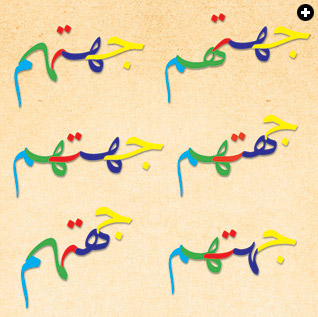
| The Arabic word meaning “their direction” demonstrates some varying steps in the calligraphic polonaise. The yellow jeem (sounds like j) appears in only one form, but can connect with the dark blue ha either from the right or from above, depending on which of the ha’s three forms comes next. The red ta can move leftward horizontally, with just a slight curve, or it can swoop downward at 45 degrees or even plunge to the vertical, again depending on the shape of the following letter, the green ha. That ha reveals a fourth form, not used by the dark blue ha, and the leftward end of its stroke, trending upward or curving downward, influences which of the two forms of the light blue meem is used, one more upright, and the other bowing to its partners in the dance. |
In Arabic-language books and newspapers today, little of the script’s richness is in evidence, due in part to a new typesetting technology developed by the German Linotype company in the 1920’s. Arabic script was yoked by Linotype’s restriction on the maximum vertical height of the letters, set too low for Arabic. The script was again forced into the square hole of a new technology as Arabic newspapers, especially, adopted the Linotype technology, primarily for economic reasons. Since then, generations of Arabs have become used to those flattened, denatured letterforms. Instead of a true Arabic script that sweeps the reader along into a dance that, for all its freedom, subtly follows the rules, the lively polonaise of the letters has been turned into a clog dance.
 sing the calligraphy of Mustafa Izzet Effendi and other great calligraphers, the Milo–Somers team took the concept of script analysis further than either Müteferrika or Mühendisyan, making the basic unit they examined not the letter but the penstroke. That made it possible to derive the dancing, shifting letters, the tens of thousands of combinations, and the variable words all from a few hundred individual penstrokes and a clear and limited set of rules—just the sort of fundamental, tabular information that computers like to use. And with modern computers, it became possible finally to resolve the conflict that has blighted the relationship between Arabic script and book-printing technology for most of five centuries.
 |
| PATRICK POST / HOLLANDSE HOOGTE |
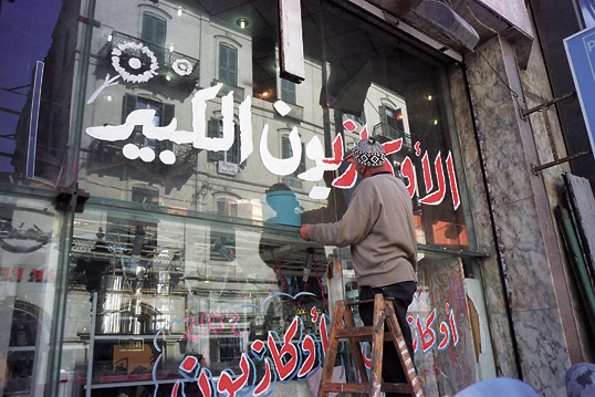
| Freehand calligraphy in Arabic, like the sign “big sale” on this shop window in Holland, follows tacit esthetic rules too complex for mechanical typesetting. |
Tasmeem’s typefaces can express the enormous variability of the individual Arabic letters as they dance through their various combinations. (Six of the more than 100 possible ways the five-letter word tasmeem can be written are on the cover of this issue.) Yet all these variations are functions of the almost subliminal rules of calligraphy, which still hold sway: They can be seen in action today wherever handwritten calligraphy is used, most visibly in banners and on shop windows across the Middle East.
nd why was this breakthrough made by three foreigners, three non-native readers and speakers of Arabic, rather than by computer-savvy young Arabs? Arabs might have led the way, Milo believes, had the Lebanese civil war in the late 1970’s and 1980’s not coincided with the development of the computer capabilities needed to tackle so complex a project. Milo was in Lebanon during the 1980’s. “The father-to-son knowledge of sophisticated typesetting still existed in Lebanon then,” he says, “and it was a country with a rich book-production heritage and a diverse population—a little like the Ottoman Empire, in fact. But precisely that country was distracted by civil war during the years that computers were changing the world of typography in the West.”
 The Milo–Somers typefaces have not escaped criticism, of course. Young designers in Lebanon object precisely to the fact that the Tasmeem fonts draw on the golden age of calligraphy in Ottoman times, saying that a break with the old styles—not replication—is what’s needed. Others object that only Ottoman calligraphy was used, pointing out that there was exquisite calligraphy in other styles done in other times and places. Neither criticism perturbs Milo: “The techniques on which Tasmeem is based can be used for other styles of Arabic script, including new styles that young designers are creating today. It’s a matter of freedom: We are no longer bound by the technological limitations of old type-founding and printing methods. This new technology gives us the ability to keep the beauty and legibility of Arabic script even when it’s computer-generated, and makes anything possible, including experimentation and innovation.”
Milo thinks, sometimes, of Müteferrika and Mühendisyan. “We see that they wrestled with the same problems we did, but we had better tools available to us. How wonderful it would be to meet them and to be able to show them proudly how we solved the problems we had in common. That would be so moving.”
http://www.river-valley.tv/conferences/non_latintypefacedesign/
| Arabist and journalist Eildert Mulder ([email protected]) writes about Islam and the Middle East for the Dutch national daily newspaper Trouw. He served as a translator for the Dutch unifil peacekeeping battalion in Lebanon in 1980 and 1981. |
| This article is translated and adapted from “Eindelijk terug naar het swingende schrift,” which appeared in Trouw on March 24, 2007. Used by permission. |


